Like A Splashed Mondrian 8
,
2026
Patrick Piccinelli
Like A Splashed Mondrian 8
2026
acrylic paint, pigment, acrylic ink on Arches paper.
acrylic paint, pigment, acrylic ink on Arches paper.
40
X
40
40
X
40
Available
€
1,400
Shipping and import duties included
Shipping and returns
- Shipping
- Packed in a double-wall box or a wooden crate and shipped from Switzerland by DHL Express within 2 to 3 days. Delivery takes 2 to 15 business days; the tracking number comes by email.
- Import duties
- Shipping, customs duties and import taxes are paid by us, for every country. Nothing is due on delivery.
- Returns
- An original painting cannot be returned or exchanged. A parcel lost or damaged in transit is refunded in full or replaced.
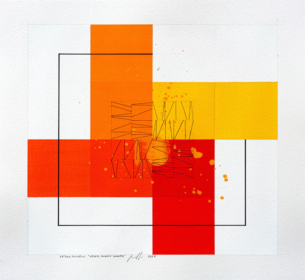
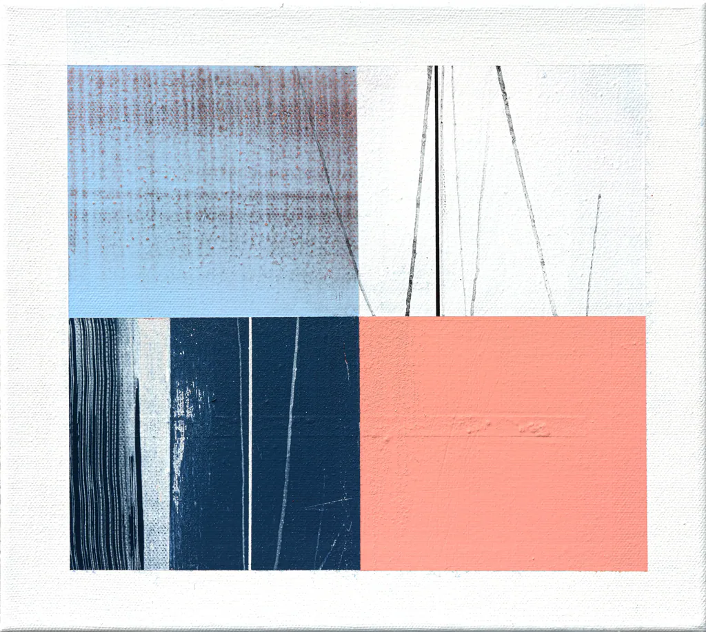
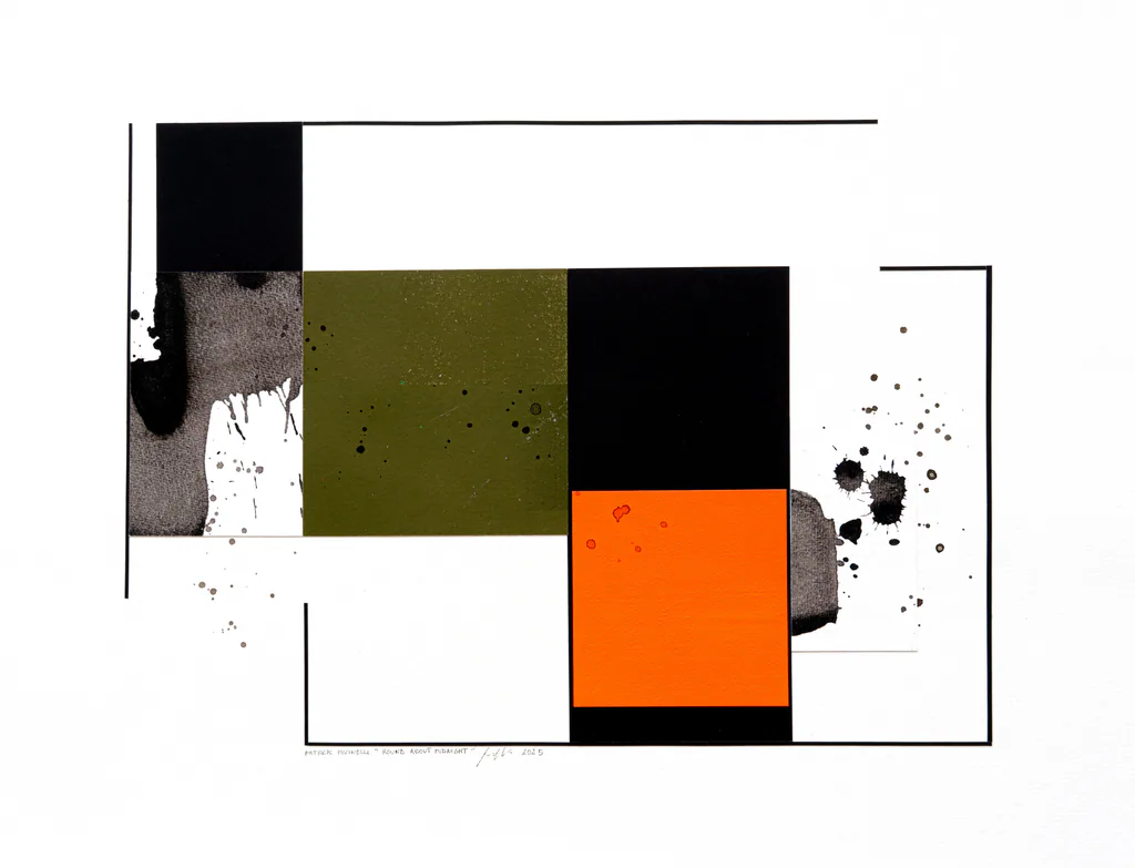
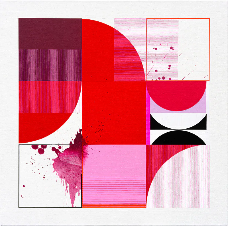
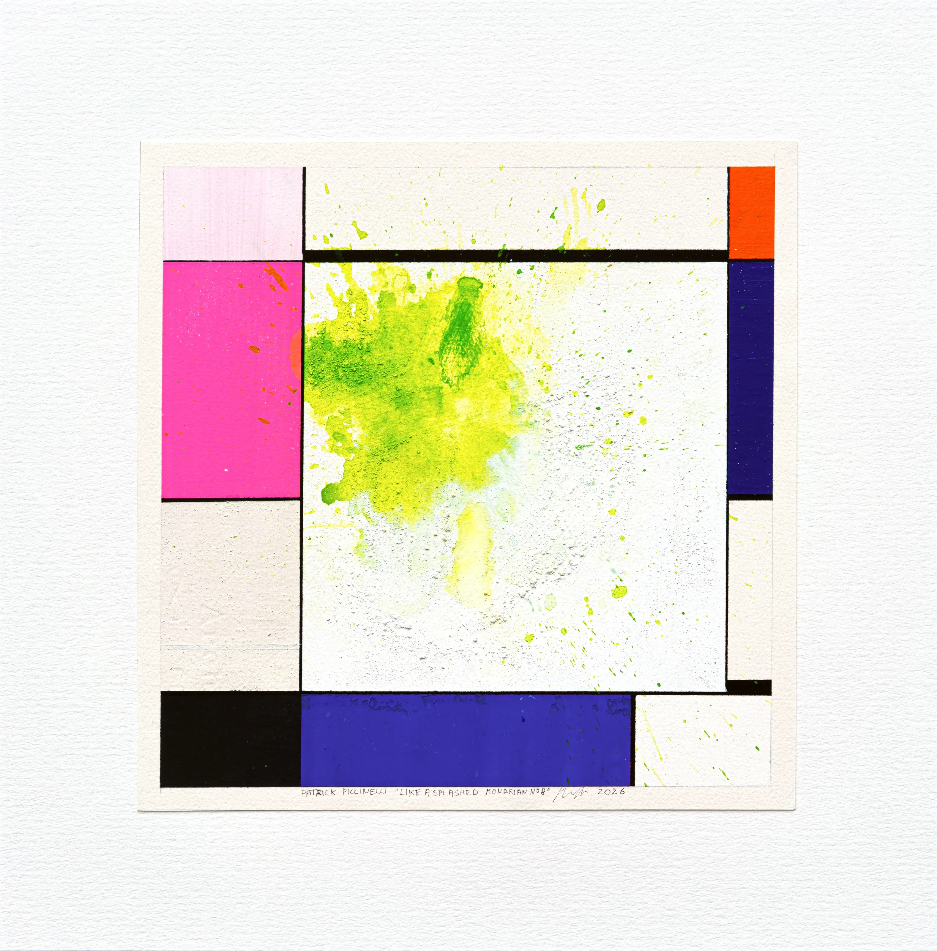
The work takes up the grammar of Piet Mondrian's neoplasticist compositions: a square format, orthogonal black lines, rectangular flat areas of unequal size, and a balance built on asymmetry rather than symmetry.
A large white central square, bounded by a black frame, takes up most of the surface. In Mondrian's work, white serves as breathing space between the coloured planes; here it becomes the real subject, a kind of stage.
The palette starts from Mondrian's primary colours (orange-red, blue, black, white) but shifts their register:
The fluorescent fuchsia pink and the acid yellow-green are hues Mondrian would never have used. They inject a contemporary energy, almost pop or neon.
The deep blue and the black anchor the composition and act as a serious counterweight to these vibrant hues.
The bright orange at the top right answers, diagonally, the central stain and the pink: an interplay of chromatic echoes.
Contrast is the heart of the work: geometric rigour, thought out and controlled, meets the spontaneous, uncontrolled gesture. The droplets in fact spill over into the neighbouring frames (at the top, at the bottom right), as if to remind us that accident ignores the grid. The stain lives in the central square, but it overflows it, which creates a tension between order and chaos.
It is a tribute coupled with a wink, which sets the geometric abstraction of the early twentieth century in dialogue with gestural abstraction.
The work takes up the grammar of Piet Mondrian's neoplasticist compositions: a square format, orthogonal black lines, rectangular flat areas of unequal size, and a balance built on asymmetry rather than symmetry.
A large white central square, bounded by a black frame, takes up most of the surface. In Mondrian's work, white serves as breathing space between the coloured planes; here it becomes the real subject, a kind of stage.
The palette starts from Mondrian's primary colours (orange-red, blue, black, white) but shifts their register:
The fluorescent fuchsia pink and the acid yellow-green are hues Mondrian would never have used. They inject a contemporary energy, almost pop or neon.
The deep blue and the black anchor the composition and act as a serious counterweight to these vibrant hues.
The bright orange at the top right answers, diagonally, the central stain and the pink: an interplay of chromatic echoes.
Contrast is the heart of the work: geometric rigour, thought out and controlled, meets the spontaneous, uncontrolled gesture. The droplets in fact spill over into the neighbouring frames (at the top, at the bottom right), as if to remind us that accident ignores the grid. The stain lives in the central square, but it overflows it, which creates a tension between order and chaos.
It is a tribute coupled with a wink, which sets the geometric abstraction of the early twentieth century in dialogue with gestural abstraction.